More Than Ink on Paper
There’s a moment when you first hold a quality art print — the weight of it, the way light catches the surface, the crispness of every line and gradient. It’s immediately different from a poster you’d find rolled up in a bin at a big box store. That difference isn’t just about the image. It’s about the medium.
The Paper Makes the Print
At MNML Studio, every art print is produced on museum-quality matte paper. This isn’t a marketing term — it refers to a specific weight (189 gsm), finish, and archival rating that ensures the print looks as good in ten years as it does today.
Matte finish was a deliberate choice. Glossy prints catch reflections and fingerprints; they look great under perfect lighting but fight with the room in every other condition. Matte paper absorbs light evenly, producing rich, consistent colors that work in any environment. It’s the difference between a print that demands specific conditions and one that simply looks beautiful wherever you hang it.
The Giclée Advantage
All MNML Studio prints use giclée printing — a process that uses microscopic ink droplets to reproduce the original artwork with extraordinary accuracy. Unlike standard inkjet printing, giclée produces smoother gradients, deeper blacks, and more nuanced color transitions.
For minimalist art, this precision matters enormously. When a design relies on subtle tonal shifts and clean geometry, every imperfection is visible. Giclée printing ensures that the quiet confidence of the original design translates perfectly to paper.
Size and Presence
A print’s impact changes dramatically with scale. A 12”x16” print works beautifully on a shelf or in a small grouping. An 18”x24” print commands a wall. And a 24”x36” print becomes the room’s focal point — the piece that visitors notice first and remember longest.
When choosing a size, consider the wall space and viewing distance. In a minimalist space where the print will likely be the primary visual element, going larger often works better. The negative space around a single large print creates more impact than a cluster of smaller pieces.
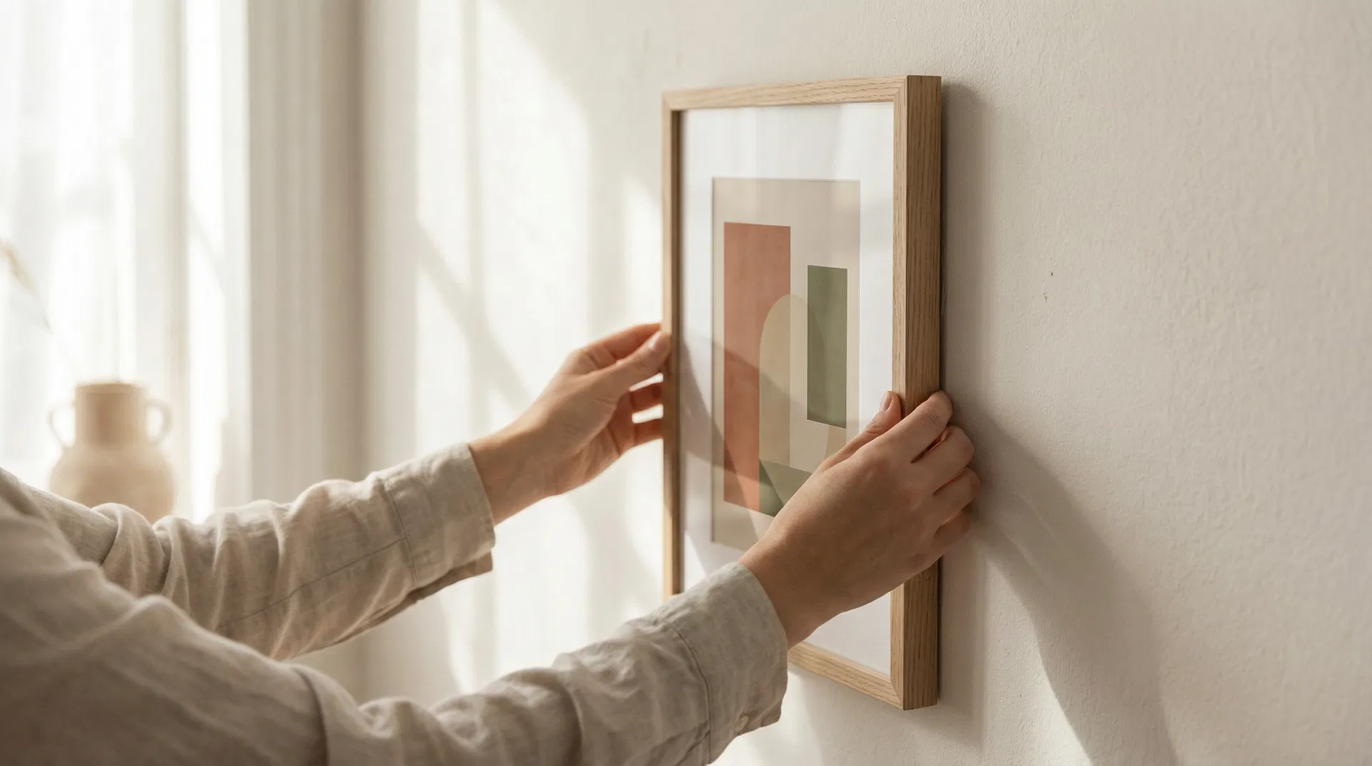
Framing Considerations
The right frame completes a print. For minimalist art, simple frames work best — thin profiles in natural wood, matte black, or white. The frame should support the art, not compete with it.
A mat border adds breathing room between the image and the frame, creating a gallery-like presentation. White or off-white mats work universally with minimalist prints. The standard recommendation is a mat width of 2-3 inches, though wider mats can add drama to smaller prints.
Museum glass (anti-reflective, UV-filtering) is worth the investment for prints in direct or indirect sunlight. It protects the archival quality of the print while eliminating the glare that standard glass produces.
Living with Art
The best art prints aren’t just decorations — they’re daily companions. A well-chosen print changes how you experience a room. It can set the mood for your morning, provide a moment of calm during a stressful day, or simply remind you of what you find beautiful.
At MNML Studio, every print is designed with this daily relationship in mind. The compositions are intentionally calm, the palettes carefully considered, and the quality built to last. Because a print you live with every day deserves to be made with the same intention you used to choose it.