It Started with a Spare
Every collection has an origin story, and Spare Life™ began the way most good ideas do — unexpectedly. It was a Tuesday night league game, the kind where the shoes are broken in and the pitchers are cold. A 7-10 split stared back from lane twelve. The spare that followed wasn’t just a good shot — it was a feeling. Redemption. Grit. The refusal to let a bad break define the frame.
That feeling became the foundation of everything in this collection.
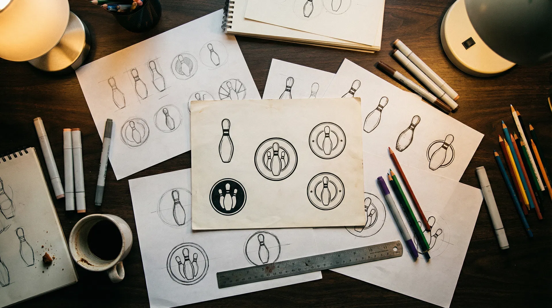
Sketching the Language
The first designs were literally drawn on bar napkins at the alley. Bowling has such a rich visual vocabulary — the geometry of pins in formation, the curves of a ball return, the bold typography of vintage lane signage. The challenge wasn’t finding inspiration; it was editing it down to what felt essential.
Each graphic in the Spare Life™ collection went through dozens of iterations. “Bowl Happens” started as a detailed illustration before being stripped back to bold type and a single pin silhouette. “Split Decision” evolved from a literal depiction of a 7-10 split into something more abstract — a design that bowlers recognize instantly but that works as pure graphic art for everyone else.
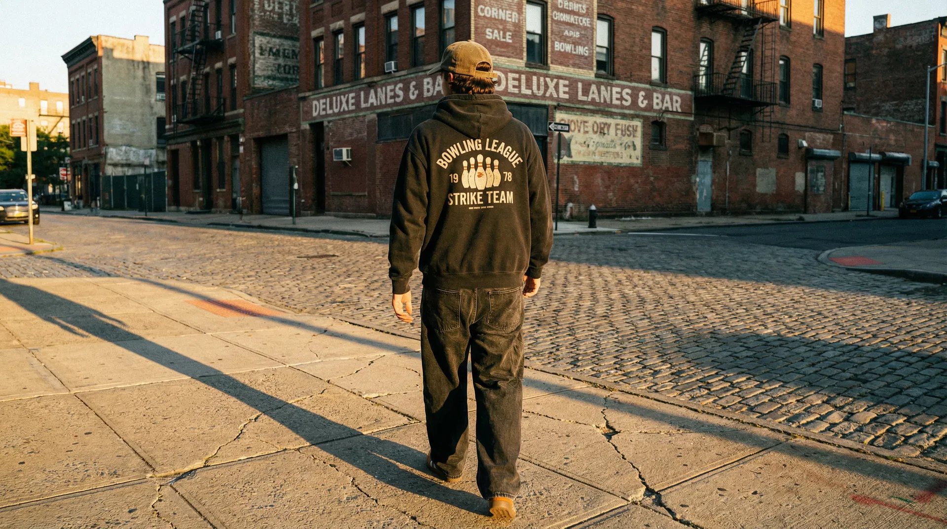
The Spare Me Story
“Spare Me” might be the most personal design in the collection. It’s the phrase every bowler mutters under their breath — part prayer, part attitude. The circular badge design was inspired by vintage bowling league patches from the 1960s and 70s, the kind you’d find sewn onto a well-worn bowling bag.
The “Every Frame Counts” tagline underneath captures the philosophy: every moment matters, every attempt counts, and the spare is where character is built.
Pin Slayer and Shut Up and Bowl
These two designs represent the louder side of bowling culture. “Pin Slayer” channels the competitive fire — that moment when you’re locked in and every ball finds the pocket. The design uses aggressive typography softened by the Spare Life™ badge, keeping it bold without losing the brand’s minimalist DNA.
“Shut Up and Bowl” is pure attitude. It’s the response to overthinking, to excuses, to the voice in your head that says you can’t convert. The design is intentionally simple — the message doesn’t need decoration.
Living the Spare Life
The “Living the Spare Life” design ties the whole collection together. It’s the lifestyle piece — a declaration that bowling isn’t just something you do, it’s part of who you are. The relaxed script typography paired with the structured badge creates a visual tension that mirrors the collection’s core idea: minimalist design meets maximalist culture.
From Screen to Shirt
Every design is produced using premium direct-to-garment printing on Bella+Canvas and Gildan blanks. The choice of print method matters — DTG allows for the subtle gradients and fine details that screen printing can’t achieve at small runs. And because everything is made to order, each piece is printed fresh, ensuring the sharpest possible reproduction of the original artwork.
The color palette across the collection is deliberately restrained: black, white, and the occasional accent. This isn’t just an aesthetic choice — it ensures every piece works together. Mix and match any Spare Life™ items and they’ll feel like they belong in the same wardrobe.
What’s Next
The Spare Life™ collection will continue to grow. New designs are already in development, inspired by more moments from the lanes — the turkey, the gutter ball comeback, the perfect game chase. Each one will follow the same principle: capture the feeling, strip away the excess, and let the design speak for itself.